
00
problem
Booking a doctor’s appointment requires people to make important decisions, such as choosing the right doctor, confirming insurance coverage, and selecting the correct appointment details. Many existing booking experiences focus on speed but overlook reassurance. Users are often asked to enter information without clearly understanding whether a provider accepts their insurance, whether the appointment details are correct, or what will happen after booking. This lack of clarity increases anxiety and can lead to errors, last-minute cancellations, delayed care, or booking abandonment. The challenge was to design an appointment booking experience that prioritizes clarity and helps users feel confident before committing to a medical visit.
solution
The solution focused on creating a guided booking experience that presents information in a clear, step-by-step flow. Rather than asking users to confirm immediately, the experience encourages informed decision-making by surfacing important details throughout the journey. Doctor information, insurance coverage, and appointment details are introduced before confirmation, followed by a dedicated review screen where users can verify everything before booking. This approach makes the process easier to understand while reducing uncertainty and helping users book with greater confidence.
DOCQ was created to make healthcare appointment booking more transparent and less overwhelming. Rather than focusing only on speed, the experience guides users through each step of the booking process, ensuring they have the information they need before confirming an appointment. By surfacing doctor details, insurance information, and a dedicated review stage, DOCQ aims to make scheduling healthcare feel simpler, clearer, and more reassuring.
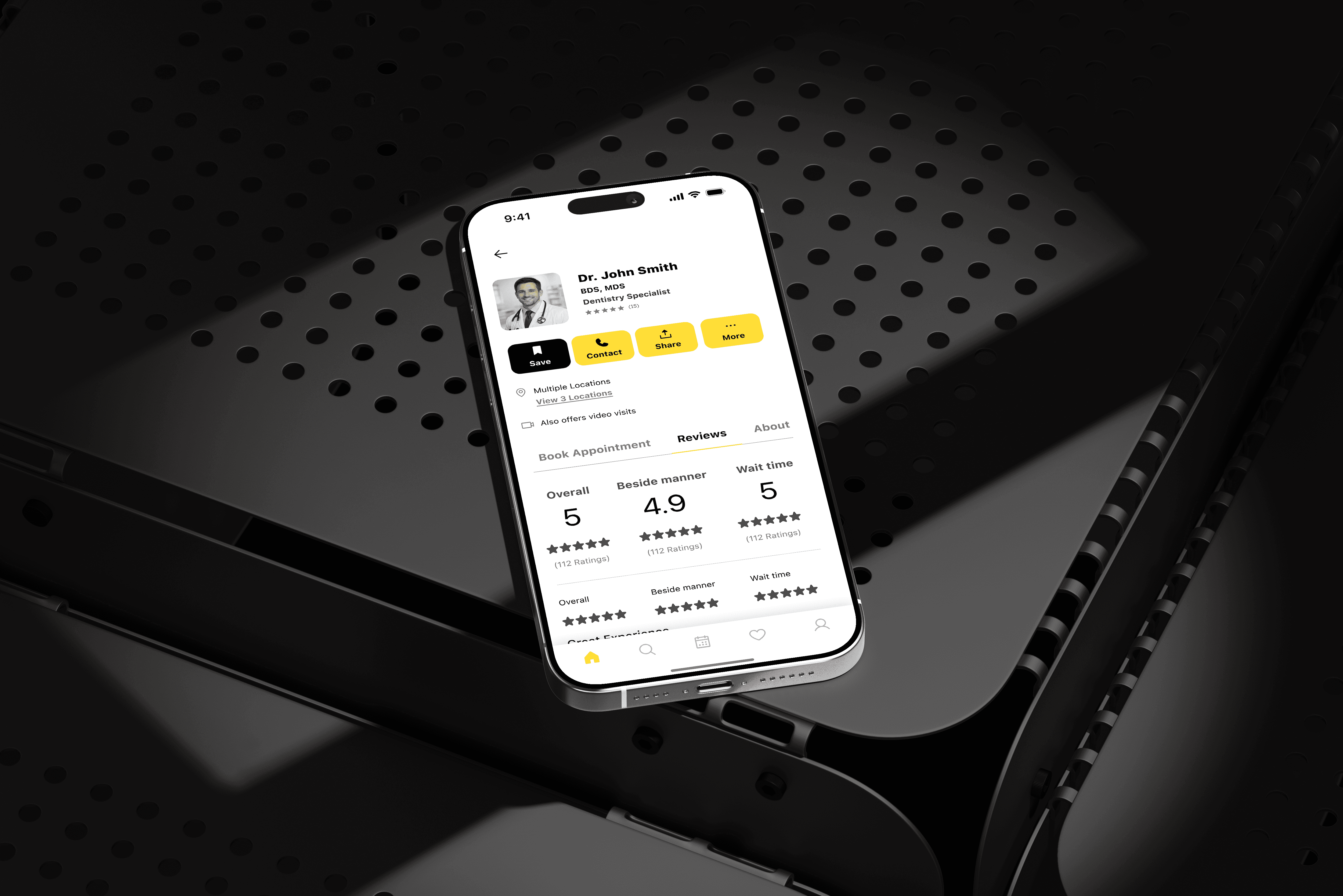
The goal of this project was not to redesign every aspect of healthcare booking, but to improve one critical part of the experience—helping users feel informed before confirming an appointment.
The design process focused on understanding the decisions users make throughout the booking journey and identifying moments where additional clarity could reduce uncertainty. Rather than adding more features, the experience was simplified by surfacing important information when it was most relevant.
From doctor selection and insurance visibility to a dedicated review screen, every design decision was made to create a booking flow that feels predictable, transparent, and easy to follow.
year
2025
timeframe
16 days
tools
Figma
category
UI/UX
see also
